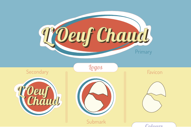
There were a few different concepts for the logo, but in the end, it was decided that it would remain simple yet still flashy. The decision to follow the red, blue, and yellow colour scheme felt classic and timeless while catering to a cheery and appetizing aesthetic.
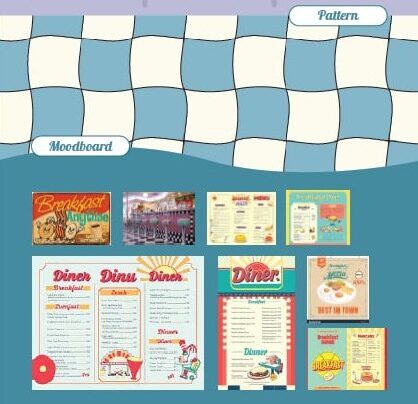
The menus are to die for! Bordered with a simple checkered pattern reminiscent of an old tablecloth, followed by an easy-to-read text separated into easy-to-follow sections.
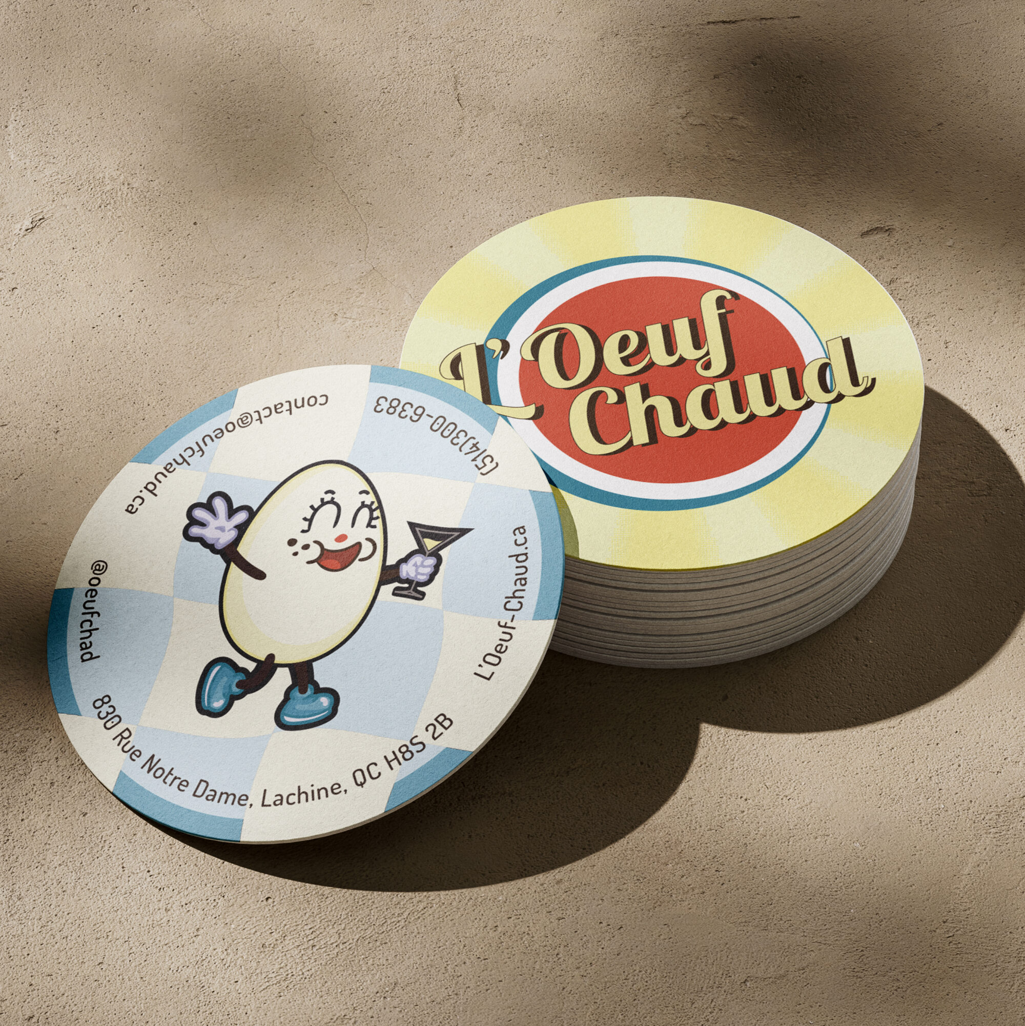
As a company, “L’Ouef Chaud” wants to stand out! So, what better way to do that than with some flashy business cards. As you can see, the business cards are an odd shape, and that’s for a very good couple of reasons. The first of which being we wanted something that would stand out from the competition given that most establishments opt for a simple rectangular business card. The second of which being that the business cards double as coasters. Thus, reducing cost and being more eco-friendly, as expanding the use of a product reduces waste.